Posts

Portrait in Type Blogger

Image
This is the Portrait in Type that I created. I have mixed feelings about this project. I enjoyed this project because I got to use one of my favorite artists, Kanye West, for this assignment. However, I don't like that I lost my original Kanye West portrait in type and had to start over from scratch. Additionally, my computer was not cooperating when doing this project. It would freeze constantly, and also just not do what I want it to do. For this project, I used a variety of letters, some of which include: L,O,C, and others. I think despite all of these problems that came with doing this project, it came out looking decent for how long it took me. I would definitely do this project again if I had to. 

Self-portrait in Color Blogger

Image
This is the self portrait in color. I decided to make a piranha plant from Super Mario. The image below this was my inspiration for my work: I didn't want to just copy it completely. So, I decided to put my actual portrait instead of the piranha at the top and bottom right where the pipes are. I decided that as a final touch I would also put a question block from Super Mario. I thought it was a nice touch since there was a bunch of space above the three pipes with my portrait.  After the review, I made some changes to the self-portrait and now it looks like this:  I decided to make the background sky blue because to me it fits with the overall theme of the portrait in color. I added two bricks on the side of the question block because in the Super Mario games you can find two bricks and a question block in the middle in that order. I added coins because they can be found in that order as well. Finally, I added a star on the top of the middle pipe because the star is the best i...

Self-Portrait Grayscale Blogger

Image
  This is my self portrait in grayscale. This project was one of the most frustrating projects in the entirety of my time being in Graphic Design. I lost my file twice because it somehow didn't save, then, when I had it, I lost most of my work. I believe that I could have done better work than what I did. I almost mixed up all of my layers as well. What also made me take so much longer than it should have was the fact that I was too zoomed in while doing this project. I wanted precision at the start. However, by the end, precision was the least of my concerns, my objective was to finish it because it's been too long. Despite all of this, I enjoyed doing this project and would consider doing this again when I am more experienced with adobe illustrator and photoshop. 

Color Theory Applied

Image
 These are my digital designs with the digital color pallets from Adobe color. For this part of the project, I used analogous colors to make this. This mostly comes from the color green. For this part of the project, I used monochromatic colors. I decided to use shades of blue in order to make this project.  For this part of the project, I used complimentary colors to make this. It involves mostly red and green and also brown. This was unintentional, but, It has a Christmas theme to it, which is nice.  For the final part of the project, I made my own choice from Adobe Color. I decided to use the shades option and use a shade of blue for the entire project. 

Repetition Online Recreation Blog

Image
 This is the online recreation of the Exploring Repetition project that I made one year ago.  For this part of my project, I decided to use four shapes. I used a circle, a triangle, a square, and a rectangle. This online recreation was most definitely more successful because I messed up the rectangle last year and had to combine it with the square, which i did not like. Now, on Illustrator, I was able to be more precise than when I drew it last year on paper.  For this part of the project, I decided to repeat the circles but changing the color as well. This was slightly harder compared to drawing it last year because I had to figure out how to create a semicircle on Illustrator. For this part of the project, I used one black circle thats at the top, 2 black semicircles under it, and 3 grey circles on the bottom. For this part of the project, I had four rows of 6 triangles (24 in total) and changed the direction of them. Most stayed the same, however, some are upside down ...

Analog and Digital Color Blog

What are pixels?: Pixels are the small squares that make up your screen. How is color viewed in computer monitors?: The way how color is viewed on computer monitors is through red, blue, and green lights (rgb.) What is the additive color space?: The additive color space is a system where different amounts of red, blue, and green lights are mixed in order to create a color. Describe which additive color sliders values in InDesign you would use to make white and black. I n order make the color white in InDesign, you need red, green, and blue at 255. In order to create black in Indesign, you set all the colors to zero. What is the subtractive color space? Subtractive color space is using the colors cyan, magenta, yellow, and black in order to mix colors in order to print. Describe which subtractive color sliders values in InDesign you would use to make white and black. In order to create white in InDesign, you set cyan, magenta, yellow, and black all to zero. In order to create black in ...

6 Column Layout on 2 page spread

Image
This project was definitely one of the more difficult projects for me. Despite this, I really enjoyed the ability to use the images that I wanted. I decided to keep a recurring theme with all my images which was memes. Some are older than others and all involve an animal. The animals here are dogs, cats and one pig. Something that I could have done better in this project is choose better images. The big smiling cat at the top right is cut off because that is the only image I could find that wasn't blocked by something or had a background. I could have made the decision to keep the images only dogs and cats but I chose the pig because it stands out compared to the others. I also chose him because his name is John. John Pork. I really enjoyed this project and the help that you gave me with it and most definitely would do it again.   

Do Now Blog

Image
 This information is important for designers because designers can use color to evoke certain emotions, attract attention, or even create an identity. An example of using color to evoke emotions is the color yellow . The color yellow is a warm color that is associated with optimism and fun.  An example of how color can be used to attract attention is by putting a different color in a design that is mostly one color. Adding a different color will make the viewer focus on it.  An example of how color can be be used to create an identity is through companies such as Apple or Nike. The logos of both of these companies use the color black. So, when you see the color black, you associate it with these companies. Therefore, creating a brand identity.

Gridded Concert Poster Blog

Image
This project was definitely one of my most favorite projects to do so far this year. The reason for this is because I got to use one of my favorite artists, which is The Weeknd. I enjoyed the fact that I could use the cover of "Trilogy" while still doing this project.  I decided to make this a one-place, one-time-only event. Trilogy released on November 13, 2012. So, I made it a 10-year anniversary show only on November 13, 2022, at Metlife Stadium because I made the decision to choose this stadium. I had another idea for this project. Although I am not quite familiar with Photoshop, I still attempted to use it for this InDesign project. I decided to remove the arms of the lady because I thought she did not fit in my project, and to me it would look cooler with just The Weeknd in a completely black background. It fits with the dark theme of trilogy.                                       ...

Hierarchy on Grid

Image
 This project was one of the more difficult projects that I have done. The reason for this is because I could not think of any ideas to create on the first day.  For the first part of this project, I decided to create a sort of downwards curve with the components you gave me. In order to create hierarchy here, I placed chunks of placeholder text below and to the side of the components. I was actually going to keep the right side completely empty, however, I decided to put the placeholder text because I felt that there was too much white space. Putting the chunks of placeholder text on the right would make the viewer focus on the components going downward. For the second part of the project, I decided to firstly fill out the page with placeholder text. Then, I decided to create a sort of vertical zig zag with the components. One at the left, one on the right, etc. This would draw the viewers attention to the components.  For the third part of the project, I decided to...

Gestalt on Grid

Image
  This is the Gestalt on Grid project. This was one of the more harder projects because of the limitations that I had while doing this project.  For the Proximity part of the Gestalt on Grid, the first and third rows were just regular text. However, for the second and fourth rows, I spaced the words in order to create proximity.  For the Similarity part of the project, I used three pieces of text on the left and right sides. The left side had an additional fourth piece of text to create a sort of L shape. On the right side, there is also a fourth piece text. However, the text is rotated so it creates similarity but it is not the exact same thing.  For the closure part of the project, I decided to mess with the tracking for the middle boxes for the left, right, top, and bottom sides. I decided to leave all of the corners as full text boxes so it is easier to see.  For the continuity part of the project, I decided to make 4 full text boxes that goes from the botto...

Hierarchy Technical

Image
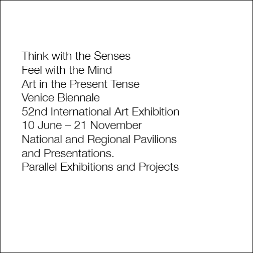
This is the Hierarchy Technical project. This was a project that was neither too easy nor too difficult, since I just had to try to replicate the images from the lesson. However, the difficult part of this project was also trying to replicate the images from the lesson. Trying to be as accurate as possible was the difficult part.  For the first part of the project, it was just the text but without anything else. https://assets.adobe.com/id/urn:aaid:sc:US:d1588fed-c259-46a8-b9fb-1b93e7cbf61c?view=published  For the second part of the project, it was the exact same as the first part but with "Venice Biennale" being in bold. https://assets.adobe.com/id/urn:aaid:sc:US:c8146815-4f25-4eae-b63a-af2e086df60f?view=published  For the third part of the project, it was the same as the second part but with "Venice Biennale" being red and bold. https://assets.adobe.com/id/urn:aaid:sc:US:ac044578-53aa-4918-8143-952aba4ef8c7?view=published For the fourth part of the project, it was...

Expressive Words

Image
The expressive words project was one of the easier projects in my opinion. I really enjoyed manipulating the words in my project until I was content.  For the first part of my project, the first word that I chose for this project is the word donut. I decided to turn the letter o and turn it into a donut by putting another o inside the o.  For the second part of my project, I decided to choose the word animal. The first two letters and the last letter of the animal stayed the same, so I can change the rest of the letters while still being able to understand what the word is. Then the letter I got turned upside down into the ! sign. The  m was actually ^ grouped together with another ^ in order for it to look like an m. For the final a in the word animal, I decided to just use the @ symbol.   For the third part of my project, I decided to choose the word stretch. For this word, obviously, I stretched out the letters as far as I possibly could.  For the fourth part...