Posts

Showing posts from October, 2024

Gridded Concert Poster Blog

Image
This project was definitely one of my most favorite projects to do so far this year. The reason for this is because I got to use one of my favorite artists, which is The Weeknd. I enjoyed the fact that I could use the cover of "Trilogy" while still doing this project.  I decided to make this a one-place, one-time-only event. Trilogy released on November 13, 2012. So, I made it a 10-year anniversary show only on November 13, 2022, at Metlife Stadium because I made the decision to choose this stadium. I had another idea for this project. Although I am not quite familiar with Photoshop, I still attempted to use it for this InDesign project. I decided to remove the arms of the lady because I thought she did not fit in my project, and to me it would look cooler with just The Weeknd in a completely black background. It fits with the dark theme of trilogy.                                       ...

Hierarchy on Grid

Image
 This project was one of the more difficult projects that I have done. The reason for this is because I could not think of any ideas to create on the first day.  For the first part of this project, I decided to create a sort of downwards curve with the components you gave me. In order to create hierarchy here, I placed chunks of placeholder text below and to the side of the components. I was actually going to keep the right side completely empty, however, I decided to put the placeholder text because I felt that there was too much white space. Putting the chunks of placeholder text on the right would make the viewer focus on the components going downward. For the second part of the project, I decided to firstly fill out the page with placeholder text. Then, I decided to create a sort of vertical zig zag with the components. One at the left, one on the right, etc. This would draw the viewers attention to the components.  For the third part of the project, I decided to...

Gestalt on Grid

Image
  This is the Gestalt on Grid project. This was one of the more harder projects because of the limitations that I had while doing this project.  For the Proximity part of the Gestalt on Grid, the first and third rows were just regular text. However, for the second and fourth rows, I spaced the words in order to create proximity.  For the Similarity part of the project, I used three pieces of text on the left and right sides. The left side had an additional fourth piece of text to create a sort of L shape. On the right side, there is also a fourth piece text. However, the text is rotated so it creates similarity but it is not the exact same thing.  For the closure part of the project, I decided to mess with the tracking for the middle boxes for the left, right, top, and bottom sides. I decided to leave all of the corners as full text boxes so it is easier to see.  For the continuity part of the project, I decided to make 4 full text boxes that goes from the botto...

Hierarchy Technical

Image
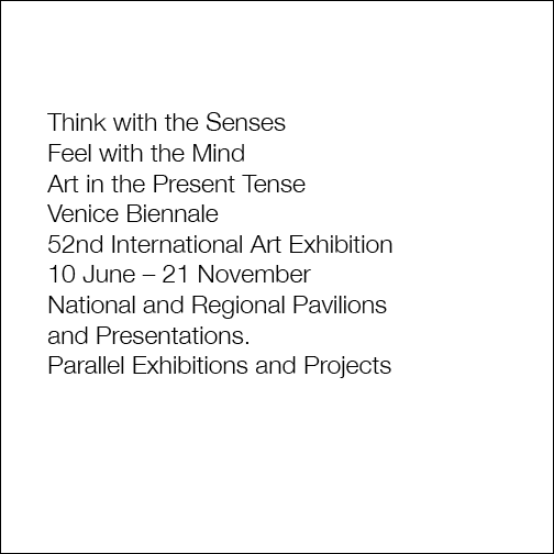
This is the Hierarchy Technical project. This was a project that was neither too easy nor too difficult, since I just had to try to replicate the images from the lesson. However, the difficult part of this project was also trying to replicate the images from the lesson. Trying to be as accurate as possible was the difficult part.  For the first part of the project, it was just the text but without anything else. https://assets.adobe.com/id/urn:aaid:sc:US:d1588fed-c259-46a8-b9fb-1b93e7cbf61c?view=published  For the second part of the project, it was the exact same as the first part but with "Venice Biennale" being in bold. https://assets.adobe.com/id/urn:aaid:sc:US:c8146815-4f25-4eae-b63a-af2e086df60f?view=published  For the third part of the project, it was the same as the second part but with "Venice Biennale" being red and bold. https://assets.adobe.com/id/urn:aaid:sc:US:ac044578-53aa-4918-8143-952aba4ef8c7?view=published For the fourth part of the project, it was...